


User research synthesis: the process of going from “Oh my god, I’m drowning in data,” to “here are the top 5 things we learnt about our users”. If it sounds hard… that’s about right—it is.
Luckily, there are ways to bring order to the chaos! I’ve spoken to Designers & Researchers from teams big and small, ranging from Etsy, Spotify and Wrike to freelancers—below are the distilled learnings from those conversations. 👇
From Chaos to Clarity
There are many different ways to approach synthesis—so which route should you go down? To choose the right approach, answer 2 questions first:
#1. Are obvious patterns naturally emerging in my data?
Sometimes in a round of usability testing, every person makes the same mistake and it’s painfully clear what the takeaway is (seriously, the users are in so much pain). In other cases, you’re swimming in pools of generative research data trying to figure out—what was the point of it all?
If the patterns are clear, synthesis becomes much lighter—focused on extracting evidence that’ll communicate the point clearly to your stakeholders (like that clip of a user pulling their hair out in frustration).
When conclusions are not-so-obvious or you want to be extra sure of your findings for an important project, it’s time to dive deeeeep into the sea of data!
“When you have a deadline and you have all this data—there’s a lack of clarity, uncertainty, and overwhelming possibilities. How do I put this into a form that can be understood?” — Samantha Reis, UX Researcher

#2. How does my brain work?
After speaking to teams around the world, we’ve found clear patterns in how people process data. There are really 3 key ways our brains convert huge masses of information into insights, and depending on the person, one of these methods just clicks:
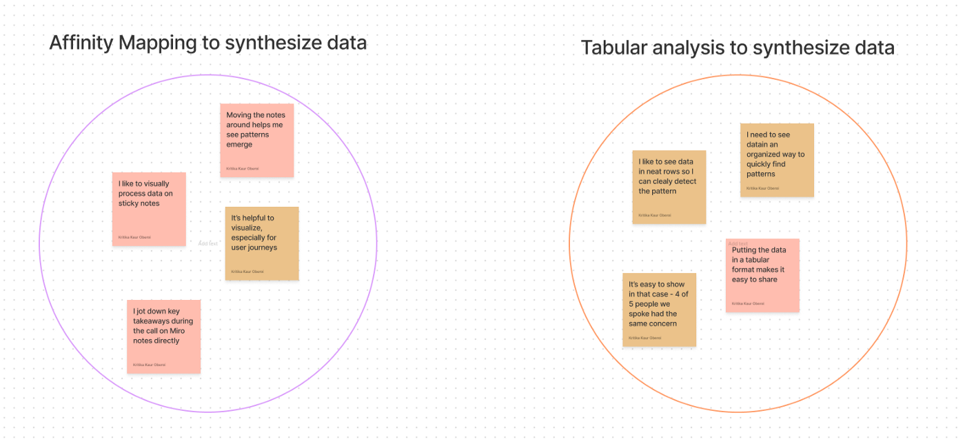
(A) Show Me the Post-Its (aka Affinity Mapping)
If drawing things out helps you think, or you spend hours creating user journeys in Miro or FigmaJam—this is you!
“Miro helps me analyze data… I put Post-Its on the canvas and start seeing if we can make clusters on how these themes are connected.”—Běla Beránková, Wrike
The process here involves 3 steps:
- Step 1: Extract data points from user conversations on separate Post-Its in FigmaJam or Miro. The data you extract can range from every participant’s response to a question (e.g., How do you think about purchases?), to specific words or turns of phrase that betray their state of mind.
- Step 2: Use different coloured Post-Its to represent dimensions that may correlate with the data. This could be the job titles, company size, geography or any other dimension that matters (e.g., all notes from conversations with researchers on orange Post-Its and conversations with designers on pink ones).
- Step 3: Get grouping! Bring notes that seem to tell the same underlying story together to see what themes emerge.
This method also works really well for collaborative synthesis—so if you need to bring in a team member or two and review data together, this may be the way to go!
(B) It’s All in My Head
Some folks have the uncanny ability to bookmark key moments from conversations in their heads, identifying patterns and constructing storylines without putting pen to paper.
- In some ways, this is the “lightest” synthesis process, because while you may highlight key quotes as evidence to pull into the final report, synthesis and storylining happens in your mind.
- Transcripts and videos are more like data banks to reference and pick out illustrative findings.
“The storyline is in my head… I may highlight data so I can pick it up easily, but I don’t need to analyze as such.” — Sanjana Purker, Spotify
(C) Structured Data Only, Please
The third category is of folks who need to see data in rows and columns, everything categorized neatly to be able to detect patterns across conversations (this is me!).
- This synthesis process involves setting up a tabular view of the data. There are a few ways to do this, but the most common is to have a separate row for each participant and a separate column for each question or hypothesis you’re gathering data on. Metadata (e.g., job title, company size) is added in columns as well, so you can quickly spot any correlations.
- The end product allows you to review each participant’s response to a question and easily detect patterns.
- Some teams circulate these tabular views of research data internally to clearly communicate findings.
“I have a spreadsheet with raw data on every person. Within the participant tab I have columns for questions, notes, and insights… I then can see that for 3 out of 5 participants, I got the same insight.”—Alex Loh, Etsy
<< Here’s an example of what my spreadsheets look like >>
Not sure which method will suit you? This can evolve a bit based on the complexity of the project and your experience in the field — but the best way to know is to give each a try!
By the way, Looppanel can auto-generate editable transcripts, create AI notes to analyze, and auto-generate affinity maps! Try it out now.


.svg)


