

.png)
Affinity mapping is a crucial tool in any UX Designer or Researcher’s research synthesis toolkit. It’s one of the best techniques to go from an overwhelming sea of sticky notes, to clear concise answers.
This guide will provide you with a clear understanding of affinity mapping, its benefits, and how to create an affinity diagram. We will also explore the difference between affinity diagrams and mind mapping, along with the tools available to aid the process.
What is an affinity diagram?
An affinity diagram is a visualization of your data where you group information based on underlying themes. Affinity diagrams are typically very visual and involve physically moving and clustering data.
Affinity diagrams, sometimes referred to as affinity maps, affinity charts, or the KJ approach, promote good decision-making and teamwork. They are often used to discover insights from raw information and make decisions based on those insights.
For old school folks, affinity diagrams involve physical Post-Its grouped into clusters on a whiteboard or wall. If you’re more digitally inclined, your affinity diagram might look like virtual stickies on a Miro or FigJam board.
What is the goal of affinity diagram?
The primary goal of an affinity diagram is to organize seemingly unrelated ideas or data into logical, related groups. This process helps simplify complex information, reveal hidden patterns, and generate new insights. Affinity maps enable teams to structure chaotic information, making it easier to analyze and act upon. By creating an affinity chart, teams can better understand relationships between different concepts and identify key themes or issues.
What is affinity mapping?
Affinity mapping is the actual technique used to help you find patterns in large amounts of data. It’s the act of clustering or grouping similar data points together so you can identify underlying patterns.
While affinity mapping, you typically start with a large volume of data (tons of notes from user interviews for example). You then review each of these data points and cluster them based on commonalities you see.
If two separate notes are talking about the theme of “lack of time” for example, you might bring those closer to each other on your whiteboard or Miroboard.
As you sift through all your data points, you start to bring notes that talk about similar topics closer to each other until a clear cluster or “theme” emerges.
The affinity diagram is a tool to identify common themes and patterns, prioritize issues, and generate innovative solutions.
So, is affinity mapping an ideation technique? Not in the strictest sense. While affinity mapping can certainly spark new ideas and inspire creative thinking, its primary purpose is to analyze and synthesize existing data. It's a way to triangulate qualitative research, to examine the information from different angles and arrive at a more robust understanding.
However, the insights generated through affinity mapping can absolutely inform and feed into ideation and innovation processes. By uncovering user needs, pain points, and opportunities, affinity mapping lays the groundwork for generating new solutions and ideas.
Use cases for affinity mapping: when to use an affinity diagram
1. Analyzing User Research
Affinity diagrams are a go-to tool for making sense of qualitative data in user research. Whether you're working with data from interviews, surveys, or usability tests, affinity mapping can help you identify patterns, themes, and insights that might otherwise be hidden in the noise.
2. Organizing UX Research
In addition to analyzing research findings, affinity diagrams can also be used to organize and manage UX research projects.
You can use affinity maps to align on the key questions your team is interested in and gather notes, data points from your research in one place.
Want to use Miro or FigJam to create a UX Research plan? Check out the 7-Step Ultimate Guide to Building Your UX Research Plan
What should you do before you create an affinity diagram?
Before starting your affinity mapping session, there are a few key steps you should take to ensure a productive and effective analysis:
- Gather and organize your data: Collect all the relevant qualitative data you want to analyze, such as user interview transcripts or survey responses. Organize the data in a format that's easy to work with, like printing quotes on individual slips of paper or creating digital cards.
- Define your focus and goals: Clarify what you're trying to achieve with your affinity diagram. Align with your team on the key questions you want to answer and the insights you're hoping to uncover.
- Set up your workspace: Choose a large, visible workspace where everyone can easily see and interact with the data. This could be a physical whiteboard or a digital canvas in a collaboration tool. Ensure you have ample room to spread out your data and create groupings.
4. Assemble your team: Involve the right people in your affinity mapping session, including members of your research team and stakeholders from other relevant functions. Aim for a diverse group that can offer well-rounded perspectives on the data.
5. Establish ground rules and norms: Set clear expectations for participation, active listening, and handling disagreements. Create a safe and productive environment for collaboration and analysis.
6. Consider a quick ice breaker: If your team is new to working together, a brief ice breaker can help build rapport and get everyone in a collaborative mindset before diving into the data.
By taking these preparatory steps, you'll set the stage for a successful affinity mapping session that yields meaningful insights and drives informed decision-making.
How to create an affinity diagram
So, you've gathered a wealth of data from user interviews and now you're ready to make sense of it.
Creating an affinity diagram may seem daunting at first, but with a little know-how, it can become a go-to tool in your UX research toolkit. In this section, we'll walk through the steps of how to do affinity mapping, from setting up your workspace to synthesizing your findings.
Whether you're working with data from interviews, surveys, or usability tests, the process is largely the same. It's a way to visually organize information, allowing you to see patterns and themes that might not be immediately apparent.
So, how do you make an affinity map? The basic steps are simple: write your data points on sticky notes, group similar notes together, and label the groups with insights. But there's an art and a science to doing it effectively.
Keep reading for the detailed steps below:
Step 1: Create a board
1. You need a board to run your affinity mapping on.
- If you’re digitally inclined or working remotely with your team, you may want to build this affinity diagram on a tool like Miro or FigJam.
- For user interviews, if you want to move into an affinity map without having to create the whole thing from scratch you can use Looppanel. Looppanel automatically creates a visual affinity map for you. You can also create and share insights you’ve noticed across your notes with team members via Looppanel
- If you are working with a team in person or you prefer working offline, you can create your Affinity Mapping board on any whiteboard, or even just a blank wall. You just need a space where you can stick Post-It Notes and move them around.
2. Ensure there's enough room to spread out the sticky notes and allow for easy grouping.
Step 2: Write each idea or data point on a separate sticky note.
- Take a moment to think about the ideas or data points you want to include in your affinity diagram. If you’re running user interviews, you may want to include all the notes you’ve made from interviews. If you’re only interested in how users reacted to a specific task, you may only want to include notes related to that task on your board.
- Write each data point down on individual sticky notes (these can be on physical Post-Its or on digital ones on Miro or FigJam) . It's important to keep each idea or data point concise and specific to ensure clarity.
Step 3: Place all the sticky notes on a surface like a whiteboard, wall, or a large sheet of paper.
Step 4: Look for similar ideas among the sticky notes and group them together.
- Begin by examining each sticky note and identifying common themes, concepts, or connections.
- Move the sticky notes closer to each other if they share similarities or relate to the same overarching idea. As you do this, you will start to see clusters forming on your workspace.
Step 5: Continue grouping the sticky notes until all ideas are organized into distinct groups or clusters. Then you:
- Take a step back and assess the emerging groups. Look for patterns, recurring themes, or relationships among the sticky notes.
- It's essential to keep refining the groups by rearranging and regrouping the sticky notes. This is to ensure coherence and logical organization.
- You may need to iterate this process several times until you are satisfied with the arrangement.
By following these steps, you create an affinity diagram. The process of affinity mapping helps you process a large amount of data. The final visualization of the affinity diagram helps you visually see cohesive groups or insights that emerged from your data points.
The affinity diagram provides a holistic view and helps in organizing information, identifying common themes, and generating insights. It's a powerful tool for understanding complex information and aid decision-making.
What are the best practices for creating affinity diagrams?
To create effective affinity diagrams that yield meaningful insights, consider the following best practices:
Do:
- Start with a clear focus and set of goals for your analysis
- Involve a diverse group of participants to bring multiple perspectives to the data
- Use concise, legible labels for each data point
- Encourage open-ended discussion and exploration of the data
- Be willing to rearrange and regroup data as new insights emerge
- Document your final diagram and insights for future reference
Don't:
- Don't prejudge or impose your own interpretations on the data
- Avoid grouping data based on superficial similarities or preconceived categories
- Don't let one person dominate the discussion or decision-making
- Avoid rushing the process or skipping over data points
- Don't get too attached to your initial groupings or labels
- Avoid creating too many or too few groups
- Don't neglect to document your process and findings
The key is to stay open, curious, and collaborative throughout the process, and to let the data guide your exploration and sense-making.
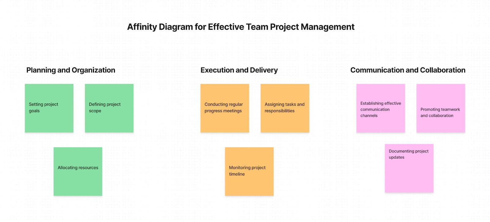
Affinity diagram examples
Let's dive into a real-life example to better understand how affinity diagrams can be used in practice. Imagine you're part of a UX research team working on improving the user experience of an e-commerce website. You've conducted a series of user interviews to gather feedback and insights.
After the interviews, you find yourself with a pile of notes and observations. You can start by placing all your notes on a whiteboard or a digital canvas. At this stage, your affinity diagram may look something like this:
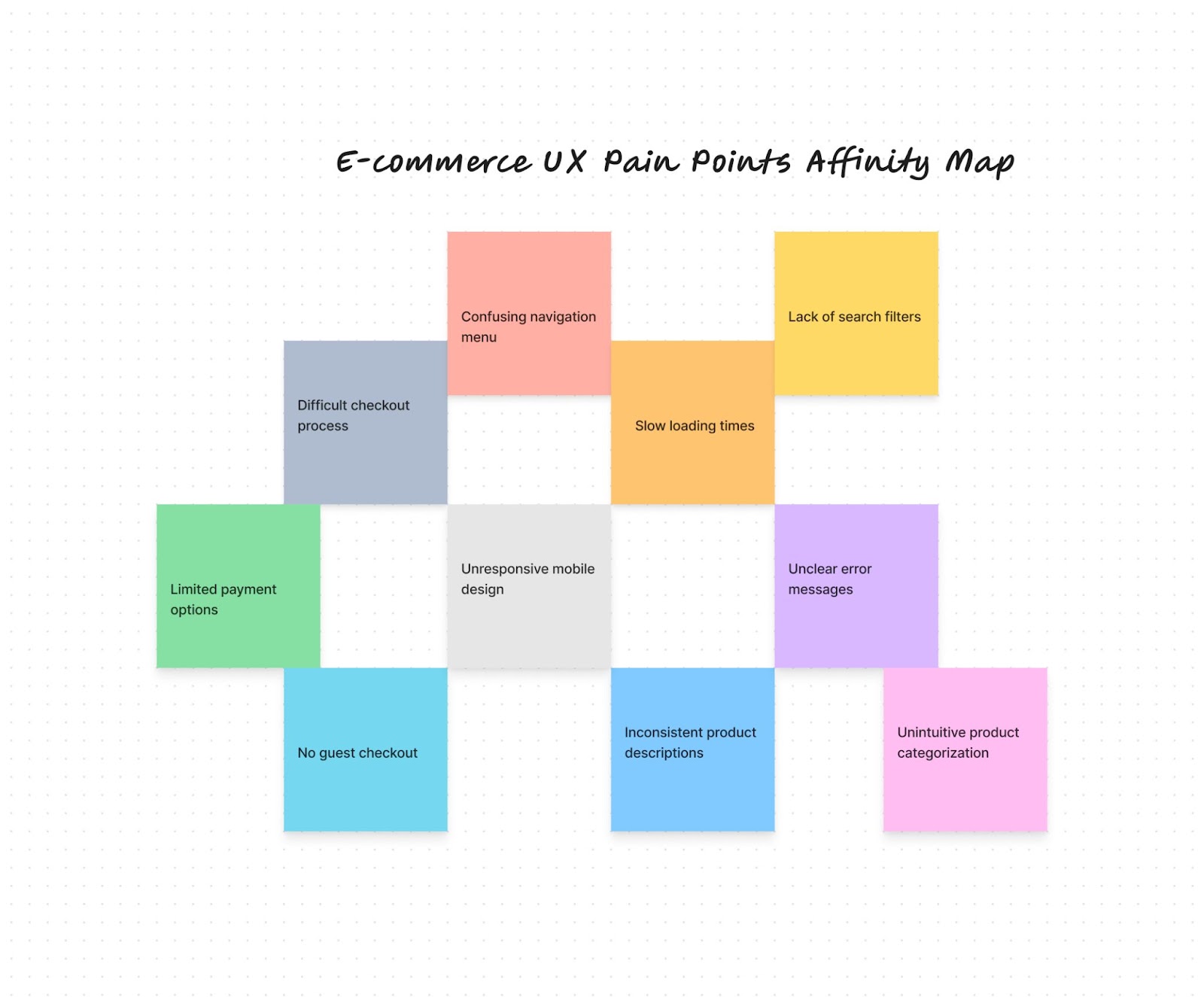
As you and your team review the notes, you'll begin to notice patterns and themes. For example, you may find that multiple notes mention difficulty in finding specific features or navigating the site. You can cluster these related notes together under a theme like "Navigation".
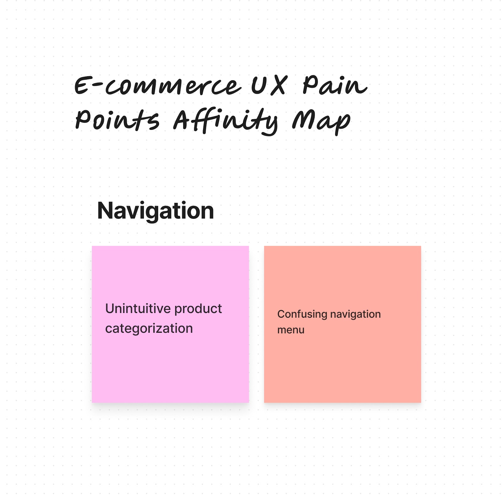
Within each theme, you can further categorize the specific pain points or suggestions provided by users. This process helps you identify common issues and prioritize areas for improvement.
As you continue to sort and group the notes, your affinity diagram will start to take shape. You'll end up with multiple clusters of data points, each representing a different theme or insight.
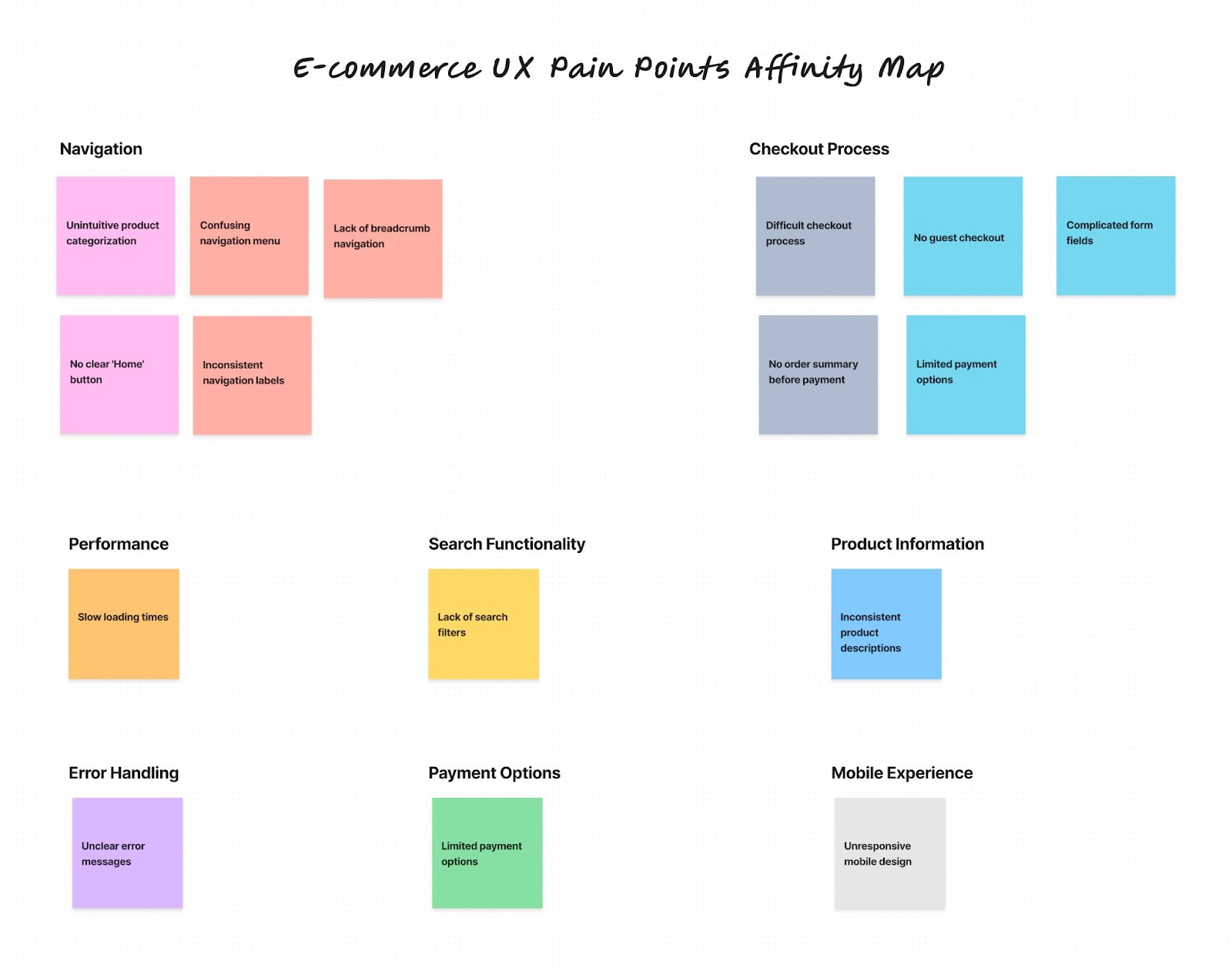
This affinity chart empowers your team to make informed decisions about how to improve the user experience. You can focus your efforts on the most critical issues and opportunities, backed by real user insights.
In this e-commerce example, the affinity diagram might highlight navigation issues, search functionality, or checkout process as key areas for improvement. Armed with this understanding, your team can take targeted actions to enhance the user interface and overall user experience.
Tools for affinity diagramming
Old school affinity mapping only requires Post Its and a whiteboard.
In the new, remote-friendly online world, you can also opt for digital affinity mapping.
Streamlining Affinity Mapping with Digital Tools and Templates
Using a digital template can make the process of affinity mapping more efficient and scalable. There are many affinity diagram tools available online, ranging from simple spreadsheets to dedicated software tools.
Digital affinity diagram templates also make it easy to collaborate with remote team members, as everyone can contribute and view the diagram in real-time. Some templates even offer additional features like tagging, filtering, or exporting, making it easier to analyze and share your findings.
Looking for the perfect Miro or FigJam template? Try these ones out:
Whether you're using a physical or digital template, the key to success with affinity diagramming is to stay flexible and iterative. Don't be afraid to rearrange groups, split or merge categories, or create new themes as you work. The beauty of affinity mapping is that it allows you to continuously refine and evolve your understanding as new data and insights emerge.
Here are the top 5 tools for affinity mapping in the digital world:
1. Looppanel
Looppanel is built specifically for analyzing user interviews.
Instead of manually copying your data onto a board, Looppanel automatically creates your affinity diagram for you based on themes or questions your notes look to answer. It simplifies the process, so even beginners can use it with ease and cuts down analysis time significantly.
Bonus: Looppanel automatically records your user interviews, and generates high-quality transcripts, and AI-powered notes in minutes.
Yes, this is aside from the affinity mapping features 🤯
Want to test it out? Sign up for a free trial
2. Miro
Miro is a collaborative online whiteboard platform that enables teams to work together remotely. It offers a range of templates, including affinity diagrams, that can be easily customized and shared with team members in real-time.
3. Mural
Mural is another digital collaboration tool that provides a virtual canvas for teams to create affinity diagrams and other visualizations. It offers a user-friendly interface and supports real-time collaboration, making it ideal for remote teams.
4. FigJam
If your company loves Figma, chances are you also have access to FigJam.
Modeled on Miro, FigJam offers a lot of the same features. It also may be a space your UX Design team is already familiar with, which is always a bonus for collaboration.
5. Lucidchart
Lucidchart is a cloud-based diagramming tool that allows you to create various types of diagrams, including affinity diagrams. It offers drag-and-drop functionality, collaboration features, and integrations with popular project management platforms.
You can explore hundreds of Lucidchart affinity diagramming templates to work you through on visualizing your organization's ideas, systems, and processes.
How to Use ChatGPT for Affinity Diagramming
Let’s be honest—as much as we love affinity diagramming, it can also be time-consuming and tedious, especially when dealing with large amounts of information. This is where artificial intelligence (AI) tools like ChatGPT can come in handy.
ChatGPT is a large language model that can understand and generate human-like text. While it may not be able to create an affinity diagram for you directly, it can assist in various stages of the process. For example, you can use ChatGPT to:
- Summarize long passages of text, such as interview transcripts or survey responses, to extract key points and insights
- Generate suggested themes or categories for grouping data points
- Provide writing assistance for labeling clusters and creating insight statements
But what about the more manual aspects of affinity mapping, like transcribing interviews, organizing data, and creating presentations?
Repurposing an AI chatbot like OpenAI for affinity mapping isn’t easy though. You’ll have to consider:
- How to break your data down to chunks that the model can consume at a time
- How to check the output from ChatGPT for hallucinations and accuracy, given that it doesn’t link to your transcript directly
- Manual work copy-pasting the ChatGPT output to wherever your team is working
- Security concerns (make sure you submit a privacy request if you don’t want OpenAI to use your data to train models)
If you want the benefits of AI to create an affinity map, without all the added steps and frustration, use a dedicated AI-powered research analysis tool like Looppanel.
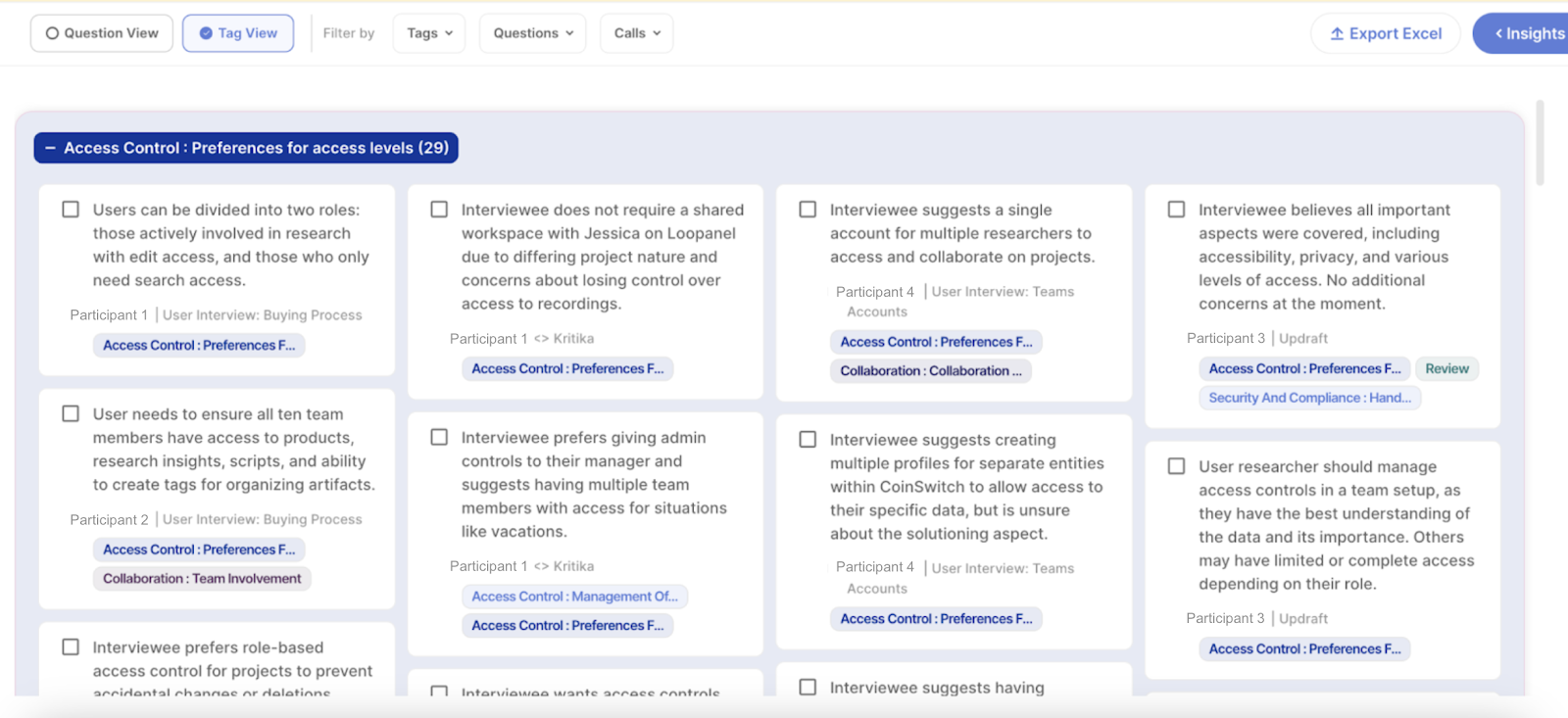
Looppanel is an AI-powered research analysis and repository product that automates many of the tedious, manual parts of research analysis. It can transcribe user interviews with over 90% accuracy, automatically generate notes for your calls, and even create video clips for presentations with a single click.
One of the most powerful features of Looppanel for affinity mapping is its ability to automatically organize your research data for analysis. It uses AI to categorize and tag your data points, making it easy to find related insights and create clusters.

Looppanel also offers a Google-like search function across all your research calls and data, so you can quickly find relevant information and pull it into your affinity diagram.
Curious to try it out? Sign up for the free trial
How to use AI for affinity mapping
AI can streamline affinity mapping by automating initial data clustering using natural language processing. Machine learning models can categorize new ideas and suggest group labels. AI-powered tools can create dynamic, interactive diagrams that update in real-time. This approach speeds up the process and handles large datasets efficiently. However, human input remains essential for context interpretation, nuanced decision-making, and drawing meaningful conclusions. The best results come from combining AI's data processing capabilities with human creativity and expertise.
Caveat: AI tools don't replace the need for human interpretation and sense-making, but they can take care of the more repetitive and time-consuming tasks, freeing you up to focus on strategic thinking and problem-solving.
Affinity mapping vs Affinity diagramming
Affinity diagramming and affinity mapping are often used to mean the same thing. They both refer to the process of sorting and grouping qualitative data. But there is a small difference in what they focus on.
Affinity diagramming is more about the physical act of making the diagram. It's about writing insights on sticky notes and putting them on a wall or board. It's a hands-on, collaborative process that gets team members actively involved.
Affinity mapping, on the other hand, is more about the mental process of seeing connections and patterns in the data. It's about making sense of the information and creating a clear, visual map of the themes that come up.
In practice, both terms involve the same core activities and you can use them interchangeably.
Mind mapping vs. Affinity diagrams
Mind mapping and affinity diagrams are two different methods of visualizing information—both can be useful in different situations.
Mind mapping uses diagrams to visually organize information, thoughts, and ideas. They are generally more organized in nature and allow for communication of complex ideas.
Mind maps are used to organize information or processes you already understand. For example, you might use a mindmap to explain the types of user research methods.
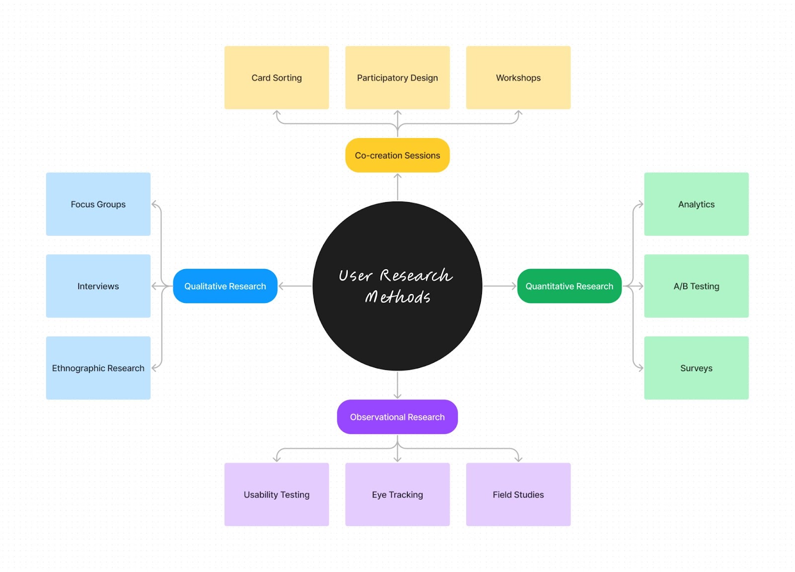
Affinity maps on the other hand, are visualizations of data where information is grouped based on underlying themes. This grouping takes place as the maker of the map reviews each piece of information on the board and moves similar data points closer together.
Affinity diagrams are used to discover insights or patterns you aren’t already aware of, while MindMaps are used to communicate ideas, concepts or processes you already know about.
FAQs
Which technique uses affinity diagrams and mind mapping?
While affinity diagrams and mind maps are both visual tools for organizing information, they are typically used in different contexts. Affinity mapping is commonly used in qualitative research and user experience (UX) design to synthesize and make sense of large amounts of data, such as user feedback or interview notes. Mind mapping, on the other hand, is often used for brainstorming, ideation, and planning. It helps to visually structure and connect related ideas or concepts. So while both techniques involve creating visual representations, they serve distinct purposes in the design thinking process.
What is the difference between empathy and affinity mapping?
Empathy mapping and affinity mapping are two distinct but related techniques used in user-centered design. Empathy mapping is a tool for building a deeper understanding of users by visualizing their thoughts, feelings, actions, and words. It helps designers step into the shoes of their users and gain insights into their needs, motivations, and pain points. Affinity mapping, on the other hand, is a method for organizing and synthesizing large amounts of qualitative data, such as user feedback or research findings. It involves grouping related data points together to identify patterns, themes, and insights. While empathy mapping focuses on understanding individual users, affinity mapping is used to make sense of data from multiple users or sources.
What is an affinity diagram in design thinking?
In the context of design thinking, an affinity diagram is a tool used in the "Define" stage of the process. After gathering data through user research and empathy building, designers use affinity mapping to organize and make sense of the information. By grouping related data points together and identifying common themes, designers can define the key insights and problem statements that will guide their ideation and prototyping efforts. Affinity diagrams help designers move from a broad understanding of user needs to a more focused and actionable problem definition. They are a crucial step in translating research findings into design opportunities.
What is affinity mapping in UX?
In user experience (UX) design, affinity mapping is a method for organizing and synthesizing qualitative data gathered through user research. It involves writing individual data points, such as user quotes, observations, or pain points, on sticky notes and then grouping related notes together to form clusters or themes. This process helps UX researchers and designers identify patterns, insights, and areas for improvement in the user experience. Affinity mapping is often used in conjunction with other UX research methods, such as user interviews, usability testing, or surveys. It allows UX professionals to make sense of large amounts of data, prioritize issues, and inform design decisions based on real user needs and feedback. Affinity mapping is a collaborative and iterative process that helps align teams around a shared understanding of the user experience.
How do you facilitate affinity mapping?
To effectively facilitate an affinity mapping session, start by clearly explaining the purpose and process to participants. Encourage open participation while setting expectations for respectful discussion. As the facilitator, ask probing questions, highlight emerging patterns, and keep the conversation on track. Maintain a neutral stance and avoid imposing your own interpretations. Create a safe, collaborative environment that allows the team to explore the data and uncover valuable insights together.
Is affinity mapping an ideation?
Affinity mapping isn't strictly ideation, but it can support it. It's primarily a method for organizing existing ideas or data. However, the process of grouping and finding patterns often sparks new insights, indirectly contributing to ideation.
What is affinity mapping in Agile?
In Agile, affinity mapping is used to organize and prioritize user stories, features, or feedback. Teams use it to identify themes in product backlogs and group-related items and make informed decisions about sprint planning and product development.
What is the difference between card sorting and affinity diagramming?
Card sorting and affinity diagramming are similar, but card sorting is typically used for organizing website content or user interface elements, often with predefined categories. Affinity diagramming is more flexible and can be used for broader idea organization without preset categories, allowing emergent groupings.
Who invented affinity diagrams?
The origins of affinity diagrams can be traced back to the 1960s and the work of Japanese anthropologist Jiro Kawakita. Kawakita developed a method called the KJ Method (named after his initials) as a way to organize and make sense of large amounts of qualitative data. The KJ Method involved writing data points on cards, grouping similar cards together, and then naming each group to capture its main theme. This process of bottom-up, iterative categorization formed the basis for what we now know as affinity diagramming. While the exact term "affinity diagram" may have emerged later, the core principles and techniques can be attributed to Kawakita's pioneering work in the field of qualitative research and data analysis.
You create an affinity diagram via the process of affinity mapping.
What are affinity diagrams in PMP?
Affinity diagrams in Project Management Professional (PMP) are visual tools used to organize and categorize large amounts of information or ideas. Project managers use affinity mapping to sort complex data into logical groups, helping identify patterns and relationships. This technique is particularly useful in brainstorming sessions, problem-solving, and requirements gathering. Affinity diagramming aids in making sense of diverse inputs and facilitating team collaboration.
What is the purpose of an affinity analysis?
Affinity analysis, also known as affinity clustering, aims to uncover relationships and patterns within diverse sets of data or ideas that might not be immediately apparent. It's used in various fields, including UX design, marketing, and project management. The purpose is to group similar items together, allowing for better understanding of complex issues, facilitating problem-solving, and supporting decision-making processes. In UX, affinity mapping helps organize user research data to identify common themes in user behavior or needs.
How do you use affinity chart?
To use an affinity chart, begin by gathering ideas or data points on individual cards or sticky notes. Participants then collaboratively group similar items together, creating clusters of related information. As patterns emerge, the team assigns descriptive labels to each group. These labeled groups are then arranged to highlight relationships between different categories. Through discussion and refinement of this organization, teams can draw meaningful conclusions and determine appropriate action items based on the newly structured information.
Affinity clustering
Affinity clustering is a versatile technique used in various fields to organize and analyze complex information. Let's explore its key aspects and applications:
What is affinity clustering?
Affinity clustering is a data analysis method that groups similar items or ideas together based on their natural relationships. This technique helps organize large amounts of information into logical categories, revealing patterns and simplifying complex data sets.
Why are affinity diagrams used?
Affinity diagrams are primarily used to organize and make sense of complex or voluminous information. They help teams identify patterns, relationships, and insights that might not be apparent when dealing with scattered data. By visually grouping related ideas, these diagrams facilitate group collaboration and consensus-building, ultimately leading to more effective problem-solving and decision-making.
How do you explain affinity mapping?
Affinity mapping is a visual brainstorming technique where ideas, data points, or insights are written on individual cards or sticky notes, then grouped into related clusters. This process enables teams to organize thoughts, find connections, and uncover themes within diverse information.
How does affinity propagation clustering work?
Affinity propagation clustering is an algorithm that identifies exemplars (representative data points) among the data and forms clusters around these exemplars. It operates by exchanging messages between data points to find clusters that maximize overall similarity, without requiring a predetermined number of clusters.
What is the purpose of an affinity diagram?
The purpose of an affinity diagram is to organize and synthesize large amounts of qualitative data or ideas. It helps teams identify patterns, prioritize information, generate insights, and facilitate problem-solving by visually grouping related concepts together.


.svg)


